


在本教程中,我們將討論警告對話框並在我們的Android應用程序中使用Kotlin實現它們。
警告對話框
警告對話框是一個彈出在屏幕上的窗口。通常它們顯示一些信息並請求用戶採取操作。構建警告對話框的三個核心組件。
- 標題文本
- 消息文本
- 按鈕 – 有三種類型的按鈕:積極的,消極的和中立的
要創建AlertDialog,我們使用AlertDialog.Builder內部類。我們將上下文傳遞給構造函數。選擇性地,我們可以傳遞另一個參數,即警告對話框樣式。
val alertDialogBuilder = AlertDialog.Builder(this)
警告對話框方法
一些可以在AlertDialog上使用的方法。
- setTitle
- setMessage
- setIcon
- setCustomTitle – 在這裡,您可以傳遞一個自定義視圖,將放置在警告對話框中標題部分的位置。
- setPositiveButton – 我們在這裡傳遞字符串名稱,以及按鈕點擊的回調方法。
- setView – 用於在警告對話框內添加自定義視圖。
- setList – 用於設置一個字符串數組,將以列表形式顯示。
- setMultiChoiceList – 再次,我們可以設置一個數組,但這次我們可以通過複選框從列表中選擇多個項目。
- setPositiveButtonIcon – 在按鈕旁邊設置一個圖標
- show() – 用於顯示AlertDialog
- setDismissListener – 在其中,您可以設置當對話框被解除時觸發的邏輯。
- setShowListener – 設置當對話框被解除時觸發的邏輯。
- setCancelable – 需要一個布爾值。默認情況下,所有警告對話框都可以通過按鈕點擊或觸摸外部進行取消。如果將此方法設置為false,則需要使用dialog.cancel()方法顯式取消對話框。
警告對話框 Kotlin 代碼
要在Android Studio項目中使用AlertDialog,請導入以下類。
import android.support.v7.app.AlertDialog;
以下Kotlin代碼用於創建一個簡單的警告對話框。
val builder = AlertDialog.Builder(this)
builder.setTitle("Androidly Alert")
builder.setMessage("We have a message")
//builder.setPositiveButton("OK", DialogInterface.OnClickListener(function = x))

builder.setPositiveButton(android.R.string.yes) { dialog, which ->
    Toast.makeText(applicationContext,
            android.R.string.yes, Toast.LENGTH_SHORT).show()
}

builder.setNegativeButton(android.R.string.no) { dialog, which ->
    Toast.makeText(applicationContext,
            android.R.string.no, Toast.LENGTH_SHORT).show()
}

builder.setNeutralButton("Maybe") { dialog, which ->
    Toast.makeText(applicationContext,
            "Maybe", Toast.LENGTH_SHORT).show()
}
builder.show()
builder.show() 顯示警示對話框在螢幕上。在 setPositiveButton 函式內,我們傳遞按鈕文字以及當按下該按鈕時觸發的 Kotlin 函式。該函式是 DialogInterface.OnClickListener() 介面的一部分。函式類型為 (DialogInterface, Int) -> Unit。DialogInterface 是 Dialog 的實例,Int 是按下的按鈕的 id。在上面的程式碼中,我們將此函式表示為高階 Kotlin 函式。dialog 和 which 代表兩個引數。如果不使用這些引數,我們可以通過傳遞 _ 來改進函式。函式看起來會像這樣:
builder.setPositiveButton(android.R.string.yes) { _,_ ->
            Toast.makeText(applicationContext,
                    android.R.string.yes, Toast.LENGTH_SHORT).show()
        }
此外,我們還可以通過 AlertDialog 類的實例來顯示對話框。將 builder.show() 替換為:
val alertDialog = builder.create()
alertDialog.show()
我們可以將按鈕點擊監聽函式定義為高階函式,而不是為每個按鈕定義函式。
val positiveButtonClick = { dialog: DialogInterface, which: Int ->
    Toast.makeText(applicationContext,
            android.R.string.no, Toast.LENGTH_SHORT).show()
}
現在,將此 val 屬性設置在 setPositiveButton Kotlin 函式內:
builder.setPositiveButton("OK", DialogInterface.OnClickListener(function = positiveButtonClick))
//or
builder.setPositiveButton(android.R.string.yes, positiveButtonClick)
後者使代碼看起來更簡潔。下面是我們的 Activity 類的屏幕截圖,應用了上面的函式於每個按鈕。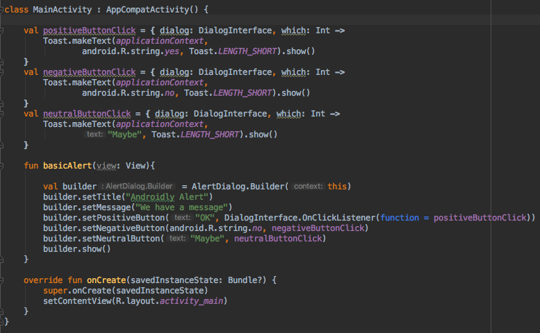
如果您不打算在按鈕點擊時執行任何操作,則可以傳遞 null 代替該函式。
Kotlin 還有更多的功能來提高上面代碼的可讀性。
簡單的 Kotlin 警告對話框代碼
使用 with 函數,我們可以提高 Kotlin 代碼的可讀性,以創建警告對話框。
fun basicAlert(view: View){

        val builder = AlertDialog.Builder(this)

        with(builder)
        {
            setTitle("Androidly Alert")
            setMessage("We have a message")
            setPositiveButton("OK", DialogInterface.OnClickListener(function = positiveButtonClick))
            setNegativeButton(android.R.string.no, negativeButtonClick)
            setNeutralButton("Maybe", neutralButtonClick)
            show()
        }


    }
在下一部分,我們將創建我們的 Android 應用程序,並在警告對話框中實現以下功能。
- 簡單的警告對話框
- 帶有圖標和按鈕自定義的警告對話框
- 帶有列表的警告對話框
- 帶有多選列表的警告對話框
- 帶有風格的警告對話框
- 帶有自定義風格的警告對話框
- 帶有EditText的警告對話框
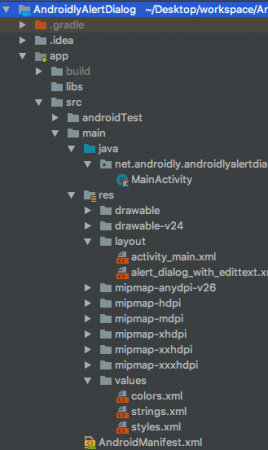
Android Studio項目結構
1. XML布局代碼
活動activity_main.xml布局的代碼如下所示。
<?xml version="1.0" encoding="utf-8"?>
<LinearLayout xmlns:android="http://schemas.android.com/apk/res/android"
    xmlns:tools="http://schemas.android.com/tools"
    android:layout_width="match_parent"
    android:layout_height="match_parent"
    android:gravity="center"
    android:orientation="vertical"
    tools:context=".MainActivity">

    <Button
        android:id="@+id/btnBasicAlert"
        android:layout_width="wrap_content"
        android:onClick="basicAlert"
        android:layout_height="wrap_content"
        android:text="BASIC ALERT DIALOG" />


    <Button
        android:id="@+id/btnAlertWithIconsAndCustomize"
        android:layout_width="wrap_content"
        android:onClick="withIconAndCustomise"
        android:layout_height="wrap_content"
        android:text="WITH ICON AND CUSTOMIZATION" />

    <Button
        android:id="@+id/btnAlertWithItems"
        android:layout_width="wrap_content"
        android:layout_height="wrap_content"
        android:onClick="withItems"
        android:text="WITH ITEMS" />

    <Button
        android:id="@+id/btnAlertWithMultiChoiceList"
        android:layout_width="wrap_content"
        android:layout_height="wrap_content"
        android:onClick="withMultiChoiceList"
        android:text="WITH MULTI CHOICE LIST" />

    <Button
        android:id="@+id/btnAlertWithStyle"
        android:layout_width="wrap_content"
        android:layout_height="wrap_content"
        android:onClick="withStyle"
        android:text="WITH STYLE" />


    <Button
        android:id="@+id/btnAlertWithCustomStyle"
        android:layout_width="wrap_content"
        android:layout_height="wrap_content"
        android:onClick="withCustomStyle"
        android:text="WITH CUSTOM STYLE" />

    <Button
        android:id="@+id/btnAlertWithButtonCentered"
        android:layout_width="wrap_content"
        android:layout_height="wrap_content"
        android:onClick="withButtonCentered"
        android:text="WITH BUTTON CENTERED" />

    <Button
        android:id="@+id/btnAlertWithEditText"
        android:layout_width="wrap_content"
        android:layout_height="wrap_content"
        android:onClick="withEditText"
        android:text="WITH EDIT TEXT" />


</LinearLayout>
對於每個按鈕,我們設置了一個帶有函數名的 android:onClick 屬性。這些 Kotlin 函數將在MainActivity.kt類中觸發。我們將逐一討論每個函數。
2. Kotlin 主活動程式碼
我們已經在上面創建了第一個警示對話框。讓我們看看 MainActivity.kt 是什麼樣子的。
package net.androidly.androidlyalertdialog

import android.content.DialogInterface
import android.support.v7.app.AppCompatActivity
import android.os.Bundle
import android.support.v7.app.AlertDialog
import android.view.View
import android.widget.Toast

class MainActivity : AppCompatActivity() {

    val positiveButtonClick = { dialog: DialogInterface, which: Int ->
        Toast.makeText(applicationContext,
                android.R.string.yes, Toast.LENGTH_SHORT).show()
    }
    val negativeButtonClick = { dialog: DialogInterface, which: Int ->
        Toast.makeText(applicationContext,
                android.R.string.no, Toast.LENGTH_SHORT).show()
    }
    val neutralButtonClick = { dialog: DialogInterface, which: Int ->
        Toast.makeText(applicationContext,
                "Maybe", Toast.LENGTH_SHORT).show()
    }

    override fun onCreate(savedInstanceState: Bundle?) {
        super.onCreate(savedInstanceState)
        setContentView(R.layout.activity_main)
    }

    fun basicAlert(view: View){

        val builder = AlertDialog.Builder(this)

        with(builder)
        {
            setTitle("Androidly Alert")
            setMessage("We have a message")
            setPositiveButton("OK", DialogInterface.OnClickListener(function = positiveButtonClick))
            setNegativeButton(android.R.string.no, negativeButtonClick)
            setNeutralButton("Maybe", neutralButtonClick)
            show()
        }


    }
}
3. 帶圖標和自定義的警示對話框
val builder = AlertDialog.Builder(this)
        with(builder) {
            setTitle("Icon and Button Color")
            setMessage("We have a message")
            setPositiveButton("OK", null)
            setNegativeButton("CANCEL", null)
            setNeutralButton("NEUTRAL", null)
            setPositiveButtonIcon(resources.getDrawable(android.R.drawable.ic_menu_call, theme))
            setIcon(resources.getDrawable(android.R.drawable.ic_dialog_alert, theme))
        }
        val alertDialog = builder.create()
        alertDialog.show()

        val button = alertDialog.getButton(DialogInterface.BUTTON_POSITIVE)
        with(button) {
            setBackgroundColor(Color.BLACK)
            setPadding(0, 0, 20, 0)
            setTextColor(Color.WHITE)
        }
使用 getButton,我們可以通過設置它們各自的常量來檢索任何按鈕。一旦按鈕被檢索,我們就可以像上面那樣自定義它。
4. 帶有項目的警示對話框
fun withItems(view: View) {

        val items = arrayOf("Red", "Orange", "Yellow", "Blue")
        val builder = AlertDialog.Builder(this)
        with(builder)
        {
            setTitle("List of Items")
            setItems(items) { dialog, which ->
                Toast.makeText(applicationContext, items[which] + " is clicked", Toast.LENGTH_SHORT).show()
            }

            setPositiveButton("OK", positiveButtonClick)
            show()
        }
    }
在 setItems 內部,我們傳遞 Kotlin 陣列。which 參數表示在列表中單擊的元素的索引。
5. 帶有多選列表的警示對話框
fun withMultiChoiceList(view: View) {

        val items = arrayOf("Microsoft", "Apple", "Amazon", "Google")
        val selectedList = ArrayList<Int>()
        val builder = AlertDialog.Builder(this)

        builder.setTitle("This is list choice dialog box")
        builder.setMultiChoiceItems(items, null
        ) { dialog, which, isChecked ->
            if (isChecked) {
                selectedList.add(which)
            } else if (selectedList.contains(which)) {
                selectedList.remove(Integer.valueOf(which))
            }
        }

        builder.setPositiveButton("DONE") { dialogInterface, i ->
            val selectedStrings = ArrayList<string>()

            for (j in selectedList.indices) {
                selectedStrings.add(items[selectedList[j]])
            }

            Toast.makeText(applicationContext, "Items selected are: " + Arrays.toString(selectedStrings.toTypedArray()), Toast.LENGTH_SHORT).show()
        }

        builder.show()

    }
在上述代碼中,我們將選擇保存在整數陣列列表中,然後再次檢索它們以在Toast消息中顯示。
6. 使用樣式的警示對話框
fun withStyle(view: View) {

        val builder = AlertDialog.Builder(ContextThemeWrapper(this, android.R.style.Holo_SegmentedButton))

        with(builder)
        {
            setTitle("Androidly Alert")
            setMessage("We have a message")
            setPositiveButton("OK", DialogInterface.OnClickListener(function = positiveButtonClick))
            setNegativeButton(android.R.string.no, negativeButtonClick)
            setNeutralButton("Maybe", neutralButtonClick)
            show()
        }
    }
如果您不使用ContextThemeWrapper,則警示對話框將顯示在全屏上。
7. 具有自定義樣式的警示對話框
在styles.xml文件中添加以下代碼:
<style name="AlertDialogCustom" parent="@android:style/Theme.Material.Dialog">
        <item name="android:textColor">@android:color/white</item>
        <item name="android:textStyle">bold</item>
        <item name="android:headerDividersEnabled">true</item>
        <item name="android:background">@android:color/holo_blue_dark</item>
    </style>
以下是Kotlin函數:
fun withCustomStyle(view: View) {

        val builder = AlertDialog.Builder(ContextThemeWrapper(this, R.style.AlertDialogCustom))

        with(builder)
        {
            setTitle("Androidly Alert")
            setMessage("We have a message")
            setPositiveButton("OK", DialogInterface.OnClickListener(function = positiveButtonClick))
            setNegativeButton(android.R.string.no, negativeButtonClick)
            setNeutralButton("Maybe", neutralButtonClick)
            show()
        }

    }
8. 具有按鈕居中的警示對話框
fun withButtonCentered(view: View) {

        val alertDialog = AlertDialog.Builder(this).create()
        alertDialog.setTitle("Title")
        alertDialog.setMessage("Message")

        alertDialog.setButton(AlertDialog.BUTTON_POSITIVE, "Yes"
        ) { dialog, which -> dialog.dismiss() }

        alertDialog.setButton(AlertDialog.BUTTON_NEGATIVE, "No"
        ) { dialog, which -> dialog.dismiss() }
        alertDialog.show()

        val btnPositive = alertDialog.getButton(AlertDialog.BUTTON_POSITIVE)
        val btnNegative = alertDialog.getButton(AlertDialog.BUTTON_NEGATIVE)

        val layoutParams = btnPositive.layoutParams as LinearLayout.LayoutParams
        layoutParams.weight = 10f
        btnPositive.layoutParams = layoutParams
        btnNegative.layoutParams = layoutParams
    }
9. 具有編輯文本的警示對話框
自定義佈局alert_dialog_with_edittext.xml的代碼如下:
<?xml version="1.0" encoding="utf-8"?>
<LinearLayout xmlns:android="http://schemas.android.com/apk/res/android"
    android:orientation="vertical"
    android:layout_width="match_parent"
    android:layout_height="match_parent">

    <EditText
        android:id="@+id/editText"
        android:layout_width="match_parent"
        android:layout_height="wrap_content"
        android:hint="Enter the text here"/>

</LinearLayout>
fun withEditText(view: View) {
        val builder = AlertDialog.Builder(this)
        val inflater = layoutInflater
        builder.setTitle("With EditText")
        val dialogLayout = inflater.inflate(R.layout.alert_dialog_with_edittext, null)
        val editText  = dialogLayout.findViewById<EditText>(R.id.editText)
        builder.setView(dialogLayout)
        builder.setPositiveButton("OK") { dialogInterface, i -> Toast.makeText(applicationContext, "EditText is " + editText.text.toString(), Toast.LENGTH_SHORT).show() }
        builder.show()
    }
以下是上述應用程序的輸出: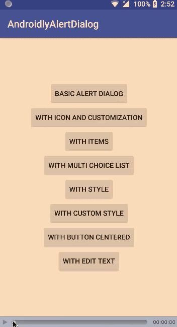
下載 Android Studio 項目:AndroidlyAlertDialog
Source:
https://www.digitalocean.com/community/tutorials/android-alert-dialog-using-kotlin