


이 튜토리얼에서는 Alert Dialogs에 대해 설명하고 Kotlin을 사용하여 Android 앱에 구현합니다.
Alert Dialogs
Alert Dialog는 화면에 팝업되는 창입니다. 일반적으로 일부 정보를 표시하고 사용자 동작을 요청합니다. Alert Dialog를 구성하는 세 가지 주요 구성 요소가 있습니다.
- 제목 텍스트
- 메시지 텍스트
- 버튼 – 긍정적, 부정적, 중립적 세 가지 유형의 버튼이 있습니다.
AlertDialog를 생성하기 위해 AlertDialog.Builder 내부 클래스를 사용합니다.
val alertDialogBuilder = AlertDialog.Builder(this)
생성자 내에 컨텍스트를 전달합니다. 선택적으로 또 다른 매개변수로 알림 대화 상자 스타일을 전달할 수도 있습니다.
Alert Dialog 메서드
AlertDialog에서 사용할 수 있는 일부 메서드입니다.
- setTitle
- setMessage
- setIcon
- setCustomTitle – 여기에는 제목 부분에 배치될 사용자 정의 뷰를 전달할 수 있습니다.
- setPositiveButton – 문자열 이름과 버튼 클릭 콜백 메서드를 전달합니다.
- setView – 경고 대화 상자 내에 사용자 정의 뷰를 추가하는 데 사용됩니다.
- setList – 배열 문자열을 설정하여 목록 형식으로 표시됩니다.
- setMultiChoiceList – 다시 배열을 설정할 수 있지만 CheckBox를 통해 목록에서 여러 항목을 선택할 수 있습니다.
- setPositiveButtonIcon – 버튼 옆에 아이콘을 설정합니다
- show() – AlertDialog를 표시하는 데 사용됩니다
- setDismissListener – 여기에서 알림 대화 상자가 해제될 때 트리거될 로직을 설정할 수 있습니다.
- setShowListener – 알림 대화 상자가 해제될 때 트리거될 로직을 설정합니다.
- setCancelable – 부울 값이 필요합니다. 기본적으로 모든 알림 대화 상자는 버튼 클릭이나 바깥쪽 터치로 취소할 수 있습니다. 이 메서드를 false로 설정하면 명시적으로 대화 상자를 dialog.cancel() 메서드를 사용하여 취소해야 합니다.
알림 대화 상자 Kotlin 코드
Android Studio 프로젝트에서 AlertDialog를 사용하려면 다음 클래스를 가져옵니다.
import android.support.v7.app.AlertDialog;
다음 Kotlin 코드는 간단한 알림 대화 상자를 만드는 데 사용됩니다.
val builder = AlertDialog.Builder(this)
builder.setTitle("Androidly Alert")
builder.setMessage("We have a message")
//builder.setPositiveButton("OK", DialogInterface.OnClickListener(function = x))

builder.setPositiveButton(android.R.string.yes) { dialog, which ->
    Toast.makeText(applicationContext,
            android.R.string.yes, Toast.LENGTH_SHORT).show()
}

builder.setNegativeButton(android.R.string.no) { dialog, which ->
    Toast.makeText(applicationContext,
            android.R.string.no, Toast.LENGTH_SHORT).show()
}

builder.setNeutralButton("Maybe") { dialog, which ->
    Toast.makeText(applicationContext,
            "Maybe", Toast.LENGTH_SHORT).show()
}
builder.show()
builder.show() 함수는 화면에 경고 대화상자를 표시합니다. setPositiveButton 함수 내에서는 버튼 텍스트와 해당 버튼을 클릭했을 때 트리거되는 Kotlin 함수를 전달합니다. 이 함수는 DialogInterface.OnClickListener() 인터페이스의 일부입니다. 함수 유형은 (DialogInterface, Int) -> Unit입니다. DialogInterface는 대화상자의 인스턴스이며 Int는 클릭한 버튼의 ID입니다. 위의 코드에서는 이 함수를 고차 코틀린 함수로 표현했습니다. dialog 및 which는 두 인수를 나타냅니다. 인수를 사용하지 않으면 _를 전달하여 함수를 개선할 수 있습니다. 함수는 다음과 같이 보일 것입니다:
builder.setPositiveButton(android.R.string.yes) { _,_ ->
            Toast.makeText(applicationContext,
                    android.R.string.yes, Toast.LENGTH_SHORT).show()
        }
대화 상자를 AlertDialog 클래스 인스턴스를 통해 표시할 수도 있습니다. builder.show()를 다음과 같이 대체합니다:
val alertDialog = builder.create()
alertDialog.show()
각 버튼에 대한 버튼 클릭 리스너 함수를 정의하는 대신 고차 함수를 별도로 정의할 수도 있습니다.
val positiveButtonClick = { dialog: DialogInterface, which: Int ->
    Toast.makeText(applicationContext,
            android.R.string.no, Toast.LENGTH_SHORT).show()
}
이제 setPositiveButton Kotlin 함수 내에서이 val 속성을 설정하세요:
builder.setPositiveButton("OK", DialogInterface.OnClickListener(function = positiveButtonClick))
//or
builder.setPositiveButton(android.R.string.yes, positiveButtonClick)
후자는 코드를 훨씬 간결하게 만듭니다. 다음은 각 버튼에이 함수를 적용한 Activity 클래스에서의 스크린샷입니다. 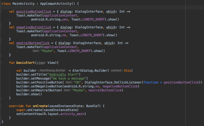
버튼 클릭에 대한 동작을 유지하려는 의도가 없다면 함수 대신 null을 전달할 수 있습니다.
코틀린은 위의 코드의 가독성을 더욱 향상시킬 수 있는 더 큰 능력을 가지고 있습니다.
간단한 알림 대화 상자 Kotlin 코드
with 함수를 사용하여 Kotlin 코드의 가독성을 향상시켜 알림 대화 상자를 만들 수 있습니다.
fun basicAlert(view: View){

        val builder = AlertDialog.Builder(this)

        with(builder)
        {
            setTitle("Androidly Alert")
            setMessage("We have a message")
            setPositiveButton("OK", DialogInterface.OnClickListener(function = positiveButtonClick))
            setNegativeButton(android.R.string.no, negativeButtonClick)
            setNeutralButton("Maybe", neutralButtonClick)
            show()
        }


    }
다음 섹션에서는 다음과 같은 기능을 우리의 AlertDialog에 구현할 Android 애플리케이션을 생성할 것입니다.
- 간단한 알림 대화 상자
- 아이콘 및 버튼 사용자 정의가 있는 알림 대화 상자
- 목록이 있는 알림 대화 상자
- 다중 선택 목록이 있는 알림 대화 상자
- 스타일이 있는 알림 대화 상자
- 사용자 정의 스타일이 있는 알림 대화 상자
- 편집 텍스트가 있는 알림 대화 상자
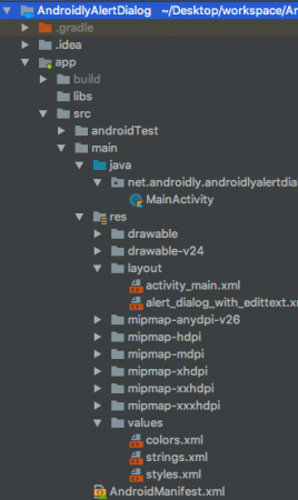
Android Studio 프로젝트 구조
1. XML 레이아웃 코드
activity_main.xml 레이아웃에 대한 코드는 아래에 제공됩니다.
<?xml version="1.0" encoding="utf-8"?>
<LinearLayout xmlns:android="http://schemas.android.com/apk/res/android"
    xmlns:tools="http://schemas.android.com/tools"
    android:layout_width="match_parent"
    android:layout_height="match_parent"
    android:gravity="center"
    android:orientation="vertical"
    tools:context=".MainActivity">

    <Button
        android:id="@+id/btnBasicAlert"
        android:layout_width="wrap_content"
        android:onClick="basicAlert"
        android:layout_height="wrap_content"
        android:text="BASIC ALERT DIALOG" />


    <Button
        android:id="@+id/btnAlertWithIconsAndCustomize"
        android:layout_width="wrap_content"
        android:onClick="withIconAndCustomise"
        android:layout_height="wrap_content"
        android:text="WITH ICON AND CUSTOMIZATION" />

    <Button
        android:id="@+id/btnAlertWithItems"
        android:layout_width="wrap_content"
        android:layout_height="wrap_content"
        android:onClick="withItems"
        android:text="WITH ITEMS" />

    <Button
        android:id="@+id/btnAlertWithMultiChoiceList"
        android:layout_width="wrap_content"
        android:layout_height="wrap_content"
        android:onClick="withMultiChoiceList"
        android:text="WITH MULTI CHOICE LIST" />

    <Button
        android:id="@+id/btnAlertWithStyle"
        android:layout_width="wrap_content"
        android:layout_height="wrap_content"
        android:onClick="withStyle"
        android:text="WITH STYLE" />


    <Button
        android:id="@+id/btnAlertWithCustomStyle"
        android:layout_width="wrap_content"
        android:layout_height="wrap_content"
        android:onClick="withCustomStyle"
        android:text="WITH CUSTOM STYLE" />

    <Button
        android:id="@+id/btnAlertWithButtonCentered"
        android:layout_width="wrap_content"
        android:layout_height="wrap_content"
        android:onClick="withButtonCentered"
        android:text="WITH BUTTON CENTERED" />

    <Button
        android:id="@+id/btnAlertWithEditText"
        android:layout_width="wrap_content"
        android:layout_height="wrap_content"
        android:onClick="withEditText"
        android:text="WITH EDIT TEXT" />


</LinearLayout>
각 버튼마다 함수 이름으로 android:onClick 속성을 설정했습니다. 이러한 Kotlin 함수는 MainActivity.kt 클래스에서 트리거됩니다. 우리는 각각을 하나씩 설명하겠습니다.
2. Kotlin Main Activity Code
이미 위에서 첫 번째 Alert 대화 상자를 만들었습니다. 이제 MainActivity.kt가 어떻게 보이는지 살펴보겠습니다.
package net.androidly.androidlyalertdialog

import android.content.DialogInterface
import android.support.v7.app.AppCompatActivity
import android.os.Bundle
import android.support.v7.app.AlertDialog
import android.view.View
import android.widget.Toast

class MainActivity : AppCompatActivity() {

    val positiveButtonClick = { dialog: DialogInterface, which: Int ->
        Toast.makeText(applicationContext,
                android.R.string.yes, Toast.LENGTH_SHORT).show()
    }
    val negativeButtonClick = { dialog: DialogInterface, which: Int ->
        Toast.makeText(applicationContext,
                android.R.string.no, Toast.LENGTH_SHORT).show()
    }
    val neutralButtonClick = { dialog: DialogInterface, which: Int ->
        Toast.makeText(applicationContext,
                "Maybe", Toast.LENGTH_SHORT).show()
    }

    override fun onCreate(savedInstanceState: Bundle?) {
        super.onCreate(savedInstanceState)
        setContentView(R.layout.activity_main)
    }

    fun basicAlert(view: View){

        val builder = AlertDialog.Builder(this)

        with(builder)
        {
            setTitle("Androidly Alert")
            setMessage("We have a message")
            setPositiveButton("OK", DialogInterface.OnClickListener(function = positiveButtonClick))
            setNegativeButton(android.R.string.no, negativeButtonClick)
            setNeutralButton("Maybe", neutralButtonClick)
            show()
        }


    }
}
3. 아이콘 및 사용자 정의가 있는 알림 대화 상자
val builder = AlertDialog.Builder(this)
        with(builder) {
            setTitle("Icon and Button Color")
            setMessage("We have a message")
            setPositiveButton("OK", null)
            setNegativeButton("CANCEL", null)
            setNeutralButton("NEUTRAL", null)
            setPositiveButtonIcon(resources.getDrawable(android.R.drawable.ic_menu_call, theme))
            setIcon(resources.getDrawable(android.R.drawable.ic_dialog_alert, theme))
        }
        val alertDialog = builder.create()
        alertDialog.show()

        val button = alertDialog.getButton(DialogInterface.BUTTON_POSITIVE)
        with(button) {
            setBackgroundColor(Color.BLACK)
            setPadding(0, 0, 20, 0)
            setTextColor(Color.WHITE)
        }
getButton을 사용하여 각 버튼을 설정하여 버튼 중 하나를 검색할 수 있습니다. 버튼을 검색한 후에는 위와 같이 사용자 정의할 수 있습니다.
4. 항목이 포함된 알림 대화 상자
fun withItems(view: View) {

        val items = arrayOf("Red", "Orange", "Yellow", "Blue")
        val builder = AlertDialog.Builder(this)
        with(builder)
        {
            setTitle("List of Items")
            setItems(items) { dialog, which ->
                Toast.makeText(applicationContext, items[which] + " is clicked", Toast.LENGTH_SHORT).show()
            }

            setPositiveButton("OK", positiveButtonClick)
            show()
        }
    }
setItems 내부에는 Kotlin 배열을 전달합니다. which 인수는 목록에서 클릭한 요소의 인덱스를 나타냅니다.
5. 다중 선택 목록이 있는 알림 대화 상자
fun withMultiChoiceList(view: View) {

        val items = arrayOf("Microsoft", "Apple", "Amazon", "Google")
        val selectedList = ArrayList<Int>()
        val builder = AlertDialog.Builder(this)

        builder.setTitle("This is list choice dialog box")
        builder.setMultiChoiceItems(items, null
        ) { dialog, which, isChecked ->
            if (isChecked) {
                selectedList.add(which)
            } else if (selectedList.contains(which)) {
                selectedList.remove(Integer.valueOf(which))
            }
        }

        builder.setPositiveButton("DONE") { dialogInterface, i ->
            val selectedStrings = ArrayList<string>()

            for (j in selectedList.indices) {
                selectedStrings.add(items[selectedList[j]])
            }

            Toast.makeText(applicationContext, "Items selected are: " + Arrays.toString(selectedStrings.toTypedArray()), Toast.LENGTH_SHORT).show()
        }

        builder.show()

    }
위의 코드에서는 선택 사항을 정수의 배열 리스트에 저장하고 다시 검색하여 Toast 메시지에 표시합니다.
6. 스타일이 있는 알림 대화상자
fun withStyle(view: View) {

        val builder = AlertDialog.Builder(ContextThemeWrapper(this, android.R.style.Holo_SegmentedButton))

        with(builder)
        {
            setTitle("Androidly Alert")
            setMessage("We have a message")
            setPositiveButton("OK", DialogInterface.OnClickListener(function = positiveButtonClick))
            setNegativeButton(android.R.string.no, negativeButtonClick)
            setNeutralButton("Maybe", neutralButtonClick)
            show()
        }
    }
ContextThemeWrapper를 사용하지 않으면 알림 대화 상자가 전체 화면에 표시됩니다.
7. 사용자 정의 스타일이 있는 알림 대화상자
다음 코드를 styles.xml 파일에 추가하십시오:
<style name="AlertDialogCustom" parent="@android:style/Theme.Material.Dialog">
        <item name="android:textColor">@android:color/white</item>
        <item name="android:textStyle">bold</item>
        <item name="android:headerDividersEnabled">true</item>
        <item name="android:background">@android:color/holo_blue_dark</item>
    </style>
다음은 Kotlin 함수입니다:
fun withCustomStyle(view: View) {

        val builder = AlertDialog.Builder(ContextThemeWrapper(this, R.style.AlertDialogCustom))

        with(builder)
        {
            setTitle("Androidly Alert")
            setMessage("We have a message")
            setPositiveButton("OK", DialogInterface.OnClickListener(function = positiveButtonClick))
            setNegativeButton(android.R.string.no, negativeButtonClick)
            setNeutralButton("Maybe", neutralButtonClick)
            show()
        }

    }
8. 버튼이 가운데 정렬된 알림 대화상자
fun withButtonCentered(view: View) {

        val alertDialog = AlertDialog.Builder(this).create()
        alertDialog.setTitle("Title")
        alertDialog.setMessage("Message")

        alertDialog.setButton(AlertDialog.BUTTON_POSITIVE, "Yes"
        ) { dialog, which -> dialog.dismiss() }

        alertDialog.setButton(AlertDialog.BUTTON_NEGATIVE, "No"
        ) { dialog, which -> dialog.dismiss() }
        alertDialog.show()

        val btnPositive = alertDialog.getButton(AlertDialog.BUTTON_POSITIVE)
        val btnNegative = alertDialog.getButton(AlertDialog.BUTTON_NEGATIVE)

        val layoutParams = btnPositive.layoutParams as LinearLayout.LayoutParams
        layoutParams.weight = 10f
        btnPositive.layoutParams = layoutParams
        btnNegative.layoutParams = layoutParams
    }
9. 편집 텍스트가 있는 알림 대화상자
사용자 정의 레이아웃 alert_dialog_with_edittext.xml의 코드는 아래에 제공됩니다.
<?xml version="1.0" encoding="utf-8"?>
<LinearLayout xmlns:android="http://schemas.android.com/apk/res/android"
    android:orientation="vertical"
    android:layout_width="match_parent"
    android:layout_height="match_parent">

    <EditText
        android:id="@+id/editText"
        android:layout_width="match_parent"
        android:layout_height="wrap_content"
        android:hint="Enter the text here"/>

</LinearLayout>
fun withEditText(view: View) {
        val builder = AlertDialog.Builder(this)
        val inflater = layoutInflater
        builder.setTitle("With EditText")
        val dialogLayout = inflater.inflate(R.layout.alert_dialog_with_edittext, null)
        val editText  = dialogLayout.findViewById<EditText>(R.id.editText)
        builder.setView(dialogLayout)
        builder.setPositiveButton("OK") { dialogInterface, i -> Toast.makeText(applicationContext, "EditText is " + editText.text.toString(), Toast.LENGTH_SHORT).show() }
        builder.show()
    }
다음 응용 프로그램의 출력은 다음과 같습니다: 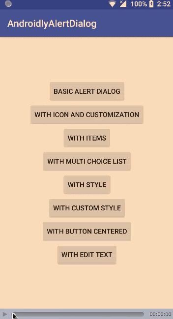
Android Studio 프로젝트 다운로드: AndroidlyAlertDialog
Source:
https://www.digitalocean.com/community/tutorials/android-alert-dialog-using-kotlin