


In this tutorial, we’ll be discussing Alert Dialogs and implement them in our Android Application using Kotlin.
Alert Dialogs
Alert Dialog is a window that pops up on the screen. They generally show some information and ask for a user action. There are three core components that build an Alert Dialog.
- Title Text
- Message Text
- Buttons – There are three types of buttons: Positive, Negative, and Neutral
To create an AlertDialog we use the AlertDialog.Builder inner class.
val alertDialogBuilder = AlertDialog.Builder(this)
We pass the context inside the constructor. Optionally, we can pass another parameter, the alert dialog style.
Alert Dialog Methods
Some of the methods that can be used on an AlertDialog.
- setTitle
- setMessage
- setIcon
- setCustomTitle – Here you can pass a custom view that’ll be put in place of the title part in the alert dialog.
- setPositiveButton – We pass the string name, as well as Button, clicked callback method here.
- setView – used to add a custom view inside the alert dialog.
- setList – used to set an array of strings which would be displayed in the form of a List.
- setMultiChoiceList – again we can set an array but this time we can select multiple items from the List thanks to CheckBox.
- setPositiveButtonIcon – set an icon alongside the Button
- show() – used to display the AlertDialog
- setDismissListener – Inside this, you can set the logic to be triggered when the alert dialog is dismissed.
- setShowListener – set the logic to be triggered when the alert dialog is dismissed.
- setCancelable – requires a boolean value. By default all alert dialogs are cancelable on button click or touch outside. If this method is set to false, you need to explicitly cancel the dialog using dialog.cancel() method.
Alert Dialog Kotlin Code
To use AlertDialog in your Android Studio project, import the following class.
import android.support.v7.app.AlertDialog;
Following Kotlin code is used to create a simple alert dialog.
val builder = AlertDialog.Builder(this)
builder.setTitle("Androidly Alert")
builder.setMessage("We have a message")
//builder.setPositiveButton("OK", DialogInterface.OnClickListener(function = x))

builder.setPositiveButton(android.R.string.yes) { dialog, which ->
    Toast.makeText(applicationContext,
            android.R.string.yes, Toast.LENGTH_SHORT).show()
}

builder.setNegativeButton(android.R.string.no) { dialog, which ->
    Toast.makeText(applicationContext,
            android.R.string.no, Toast.LENGTH_SHORT).show()
}

builder.setNeutralButton("Maybe") { dialog, which ->
    Toast.makeText(applicationContext,
            "Maybe", Toast.LENGTH_SHORT).show()
}
builder.show()
The builder.show() displays the Alert Dialog on the screen. Inside the setPositiveButton function, we pass the Button text along with a Kotlin function that’s triggered when that button is clicked. The function is a part of the DialogInterface.OnClickListener() interface. The function type is (DialogInterface, Int) -> Unit. DialogInterface is an instance of the Dialog and Int is the id of the button that is clicked. In the above code, we’ve represented this function as a Higher Order Kotlin function. The dialog and which represents the two arguments. We can improve the function by passing _ if the arguments aren’t used. The functions would look like these:
builder.setPositiveButton(android.R.string.yes) { _,_ ->
            Toast.makeText(applicationContext,
                    android.R.string.yes, Toast.LENGTH_SHORT).show()
        }
Alternatively, we can also display the Dialog through the AlertDialog class instance. Replace builder.show() with:
val alertDialog = builder.create()
alertDialog.show()
Instead of defining the button click listener functions for each of the buttons, we can define the higher-order functions separately as well.
val positiveButtonClick = { dialog: DialogInterface, which: Int ->
    Toast.makeText(applicationContext,
            android.R.string.no, Toast.LENGTH_SHORT).show()
}
Now set this val property inside the setPositiveButton Kotlin function as:
builder.setPositiveButton("OK", DialogInterface.OnClickListener(function = positiveButtonClick))
//or
builder.setPositiveButton(android.R.string.yes, positiveButtonClick)
The latter makes the code look much concise. Following is a screenshot from our Activity class with the above function applied for each of the Buttons. 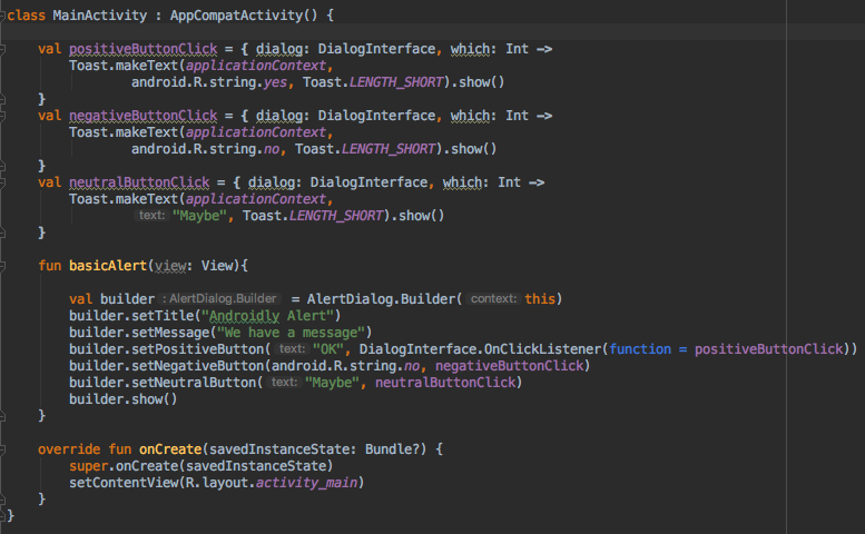
You can pass a null instead of the function if you don’t intend to keep any action on the button click.
Kotlin has still more power to improve the readability of the above code.
Simple Alert Dialog Kotlin code
Using the with function, we can enhance the readability of the Kotlin code to create an Alert Dialog.
fun basicAlert(view: View){

        val builder = AlertDialog.Builder(this)

        with(builder)
        {
            setTitle("Androidly Alert")
            setMessage("We have a message")
            setPositiveButton("OK", DialogInterface.OnClickListener(function = positiveButtonClick))
            setNegativeButton(android.R.string.no, negativeButtonClick)
            setNeutralButton("Maybe", neutralButtonClick)
            show()
        }


    }
In the next section we’ll be creating our Android Application where we will implement the following features in our AlertDialog.
- Simple Alert Dialog
- Alert Dialog With Icon and Button Customisation
- Alert Dialog With List
- Alert Dialog With MultiChoice List
- Alert Dialog With Style
- Alert Dialog With Custom Style
- Alert Dialog With EditText
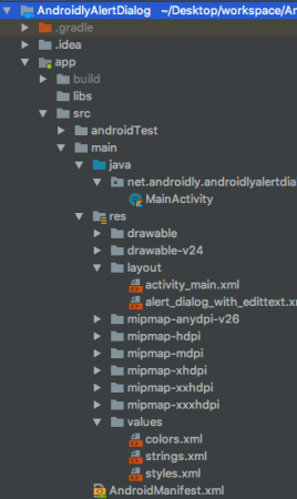
Android Studio Project Structure
1. XML Layout Code
The code for the activity_main.xml layout is given below.
<?xml version="1.0" encoding="utf-8"?>
<LinearLayout xmlns:android="http://schemas.android.com/apk/res/android"
    xmlns:tools="http://schemas.android.com/tools"
    android:layout_width="match_parent"
    android:layout_height="match_parent"
    android:gravity="center"
    android:orientation="vertical"
    tools:context=".MainActivity">

    <Button
        android:id="@+id/btnBasicAlert"
        android:layout_width="wrap_content"
        android:onClick="basicAlert"
        android:layout_height="wrap_content"
        android:text="BASIC ALERT DIALOG" />


    <Button
        android:id="@+id/btnAlertWithIconsAndCustomize"
        android:layout_width="wrap_content"
        android:onClick="withIconAndCustomise"
        android:layout_height="wrap_content"
        android:text="WITH ICON AND CUSTOMIZATION" />

    <Button
        android:id="@+id/btnAlertWithItems"
        android:layout_width="wrap_content"
        android:layout_height="wrap_content"
        android:onClick="withItems"
        android:text="WITH ITEMS" />

    <Button
        android:id="@+id/btnAlertWithMultiChoiceList"
        android:layout_width="wrap_content"
        android:layout_height="wrap_content"
        android:onClick="withMultiChoiceList"
        android:text="WITH MULTI CHOICE LIST" />

    <Button
        android:id="@+id/btnAlertWithStyle"
        android:layout_width="wrap_content"
        android:layout_height="wrap_content"
        android:onClick="withStyle"
        android:text="WITH STYLE" />


    <Button
        android:id="@+id/btnAlertWithCustomStyle"
        android:layout_width="wrap_content"
        android:layout_height="wrap_content"
        android:onClick="withCustomStyle"
        android:text="WITH CUSTOM STYLE" />

    <Button
        android:id="@+id/btnAlertWithButtonCentered"
        android:layout_width="wrap_content"
        android:layout_height="wrap_content"
        android:onClick="withButtonCentered"
        android:text="WITH BUTTON CENTERED" />

    <Button
        android:id="@+id/btnAlertWithEditText"
        android:layout_width="wrap_content"
        android:layout_height="wrap_content"
        android:onClick="withEditText"
        android:text="WITH EDIT TEXT" />


</LinearLayout>
For each of the buttons we’ve set an android:onClick attribute with the function name. These Kotlin functions would be triggered in the MainActivity.kt class. We’ll discuss each of them one at a time.
2. Kotlin Main Activity Code
We’ve already created the first Alert Dialog above. Let’s see how the MainActivity.kt looks with it.
package net.androidly.androidlyalertdialog

import android.content.DialogInterface
import android.support.v7.app.AppCompatActivity
import android.os.Bundle
import android.support.v7.app.AlertDialog
import android.view.View
import android.widget.Toast

class MainActivity : AppCompatActivity() {

    val positiveButtonClick = { dialog: DialogInterface, which: Int ->
        Toast.makeText(applicationContext,
                android.R.string.yes, Toast.LENGTH_SHORT).show()
    }
    val negativeButtonClick = { dialog: DialogInterface, which: Int ->
        Toast.makeText(applicationContext,
                android.R.string.no, Toast.LENGTH_SHORT).show()
    }
    val neutralButtonClick = { dialog: DialogInterface, which: Int ->
        Toast.makeText(applicationContext,
                "Maybe", Toast.LENGTH_SHORT).show()
    }

    override fun onCreate(savedInstanceState: Bundle?) {
        super.onCreate(savedInstanceState)
        setContentView(R.layout.activity_main)
    }

    fun basicAlert(view: View){

        val builder = AlertDialog.Builder(this)

        with(builder)
        {
            setTitle("Androidly Alert")
            setMessage("We have a message")
            setPositiveButton("OK", DialogInterface.OnClickListener(function = positiveButtonClick))
            setNegativeButton(android.R.string.no, negativeButtonClick)
            setNeutralButton("Maybe", neutralButtonClick)
            show()
        }


    }
}
3. Alert Dialog With Icons and Customisation
val builder = AlertDialog.Builder(this)
        with(builder) {
            setTitle("Icon and Button Color")
            setMessage("We have a message")
            setPositiveButton("OK", null)
            setNegativeButton("CANCEL", null)
            setNeutralButton("NEUTRAL", null)
            setPositiveButtonIcon(resources.getDrawable(android.R.drawable.ic_menu_call, theme))
            setIcon(resources.getDrawable(android.R.drawable.ic_dialog_alert, theme))
        }
        val alertDialog = builder.create()
        alertDialog.show()

        val button = alertDialog.getButton(DialogInterface.BUTTON_POSITIVE)
        with(button) {
            setBackgroundColor(Color.BLACK)
            setPadding(0, 0, 20, 0)
            setTextColor(Color.WHITE)
        }
Using the getButton, we can retrieve any of the Buttons by setting their respective constant. Once the Button is retrieved, we can customise it as done above.
4. Alert Dialog With Items
fun withItems(view: View) {

        val items = arrayOf("Red", "Orange", "Yellow", "Blue")
        val builder = AlertDialog.Builder(this)
        with(builder)
        {
            setTitle("List of Items")
            setItems(items) { dialog, which ->
                Toast.makeText(applicationContext, items[which] + " is clicked", Toast.LENGTH_SHORT).show()
            }

            setPositiveButton("OK", positiveButtonClick)
            show()
        }
    }
Inside the setItems we pass the Kotlin Array. The which argument represents the index of the element clicked in the List.
5. Alert Dialog With MultiChoice List
fun withMultiChoiceList(view: View) {

        val items = arrayOf("Microsoft", "Apple", "Amazon", "Google")
        val selectedList = ArrayList<Int>()
        val builder = AlertDialog.Builder(this)

        builder.setTitle("This is list choice dialog box")
        builder.setMultiChoiceItems(items, null
        ) { dialog, which, isChecked ->
            if (isChecked) {
                selectedList.add(which)
            } else if (selectedList.contains(which)) {
                selectedList.remove(Integer.valueOf(which))
            }
        }

        builder.setPositiveButton("DONE") { dialogInterface, i ->
            val selectedStrings = ArrayList<string>()

            for (j in selectedList.indices) {
                selectedStrings.add(items[selectedList[j]])
            }

            Toast.makeText(applicationContext, "Items selected are: " + Arrays.toString(selectedStrings.toTypedArray()), Toast.LENGTH_SHORT).show()
        }

        builder.show()

    }
In the above code, we save the choices in an array list of integers and retrieve them again to show them in the Toast message.
6. Alert Dialog With Style
fun withStyle(view: View) {

        val builder = AlertDialog.Builder(ContextThemeWrapper(this, android.R.style.Holo_SegmentedButton))

        with(builder)
        {
            setTitle("Androidly Alert")
            setMessage("We have a message")
            setPositiveButton("OK", DialogInterface.OnClickListener(function = positiveButtonClick))
            setNegativeButton(android.R.string.no, negativeButtonClick)
            setNeutralButton("Maybe", neutralButtonClick)
            show()
        }
    }
If you don’t use ContextThemeWrapper, the Alert Dialog would be displayed on the full screen.
7. Alert Dialog With Custom Style
Add the following code in the styles.xml file:
<style name="AlertDialogCustom" parent="@android:style/Theme.Material.Dialog">
        <item name="android:textColor">@android:color/white</item>
        <item name="android:textStyle">bold</item>
        <item name="android:headerDividersEnabled">true</item>
        <item name="android:background">@android:color/holo_blue_dark</item>
    </style>
Following is the Kotlin function:
fun withCustomStyle(view: View) {

        val builder = AlertDialog.Builder(ContextThemeWrapper(this, R.style.AlertDialogCustom))

        with(builder)
        {
            setTitle("Androidly Alert")
            setMessage("We have a message")
            setPositiveButton("OK", DialogInterface.OnClickListener(function = positiveButtonClick))
            setNegativeButton(android.R.string.no, negativeButtonClick)
            setNeutralButton("Maybe", neutralButtonClick)
            show()
        }

    }
8. Alert Dialog With Button Centered
fun withButtonCentered(view: View) {

        val alertDialog = AlertDialog.Builder(this).create()
        alertDialog.setTitle("Title")
        alertDialog.setMessage("Message")

        alertDialog.setButton(AlertDialog.BUTTON_POSITIVE, "Yes"
        ) { dialog, which -> dialog.dismiss() }

        alertDialog.setButton(AlertDialog.BUTTON_NEGATIVE, "No"
        ) { dialog, which -> dialog.dismiss() }
        alertDialog.show()

        val btnPositive = alertDialog.getButton(AlertDialog.BUTTON_POSITIVE)
        val btnNegative = alertDialog.getButton(AlertDialog.BUTTON_NEGATIVE)

        val layoutParams = btnPositive.layoutParams as LinearLayout.LayoutParams
        layoutParams.weight = 10f
        btnPositive.layoutParams = layoutParams
        btnNegative.layoutParams = layoutParams
    }
9. Alert Dialog With Edit Text
The code for the custom layout alert_dialog_with_edittext.xml is given below:
<?xml version="1.0" encoding="utf-8"?>
<LinearLayout xmlns:android="http://schemas.android.com/apk/res/android"
    android:orientation="vertical"
    android:layout_width="match_parent"
    android:layout_height="match_parent">

    <EditText
        android:id="@+id/editText"
        android:layout_width="match_parent"
        android:layout_height="wrap_content"
        android:hint="Enter the text here"/>

</LinearLayout>
fun withEditText(view: View) {
        val builder = AlertDialog.Builder(this)
        val inflater = layoutInflater
        builder.setTitle("With EditText")
        val dialogLayout = inflater.inflate(R.layout.alert_dialog_with_edittext, null)
        val editText  = dialogLayout.findViewById<EditText>(R.id.editText)
        builder.setView(dialogLayout)
        builder.setPositiveButton("OK") { dialogInterface, i -> Toast.makeText(applicationContext, "EditText is " + editText.text.toString(), Toast.LENGTH_SHORT).show() }
        builder.show()
    }
The output of the above application is given below: 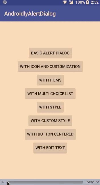
Download Android Studio Project: AndroidlyAlertDialog
Source:
https://www.digitalocean.com/community/tutorials/android-alert-dialog-using-kotlin